Development Guidelines
Definitions
- UI Components: Components that provide specific functionality and user interactions. They are responsible for displaying and interacting with data and user input.
- Layout Components: Components that are only concerned with arranging their children in a certain way. They can be composed to create more complex layouts.
Coding
Naming
Try to use names from Open UI for components and their props.
File Structure
- Always use named export and not export default for everything (better debugging experience).
- Use interface to specify component props.
- Use a barrel file to define public components and functions.
- Every component has its own folder (named after it). The folder contains
- the barrel file (
index.ts), - the implementation of the component (
<component name>.tsx), - the story file (
<component name>.stories.tsx), - the test file (
<component name>.test.tsx), - helpers and child components (
<child component name>.tsx,Context.tsx, …).
- the barrel file (
- general helper functions are in
@marigold/system(e.g.,useTheme).
Here is an example of our file structure:
components
└── src
    ├── Button
    │   ├── Button.tsx
    │   ├── Button.test.tsx
    │   ├── Button.stories.tsx
    │   └── index.ts
    ├── Menu
    │   ├── ActionMenu.tsx
    │   ├── Context.ts
    │   ├── index.ts
    │   ├── Menu.stories.tsx
    │   ├── Menu.test.tsx
    │   ├── Menu.tsx
    │   ├── MenuItem.tsx
    │   ├── MenuSection.tsx
    │   └── MenuTrigger.tsx
    └── index.ts
Writing Tests
- Use
@testing-library/user-eventfor testing user interactions. - Use
@testing-library/reactfor testing hooks. - Use the
setuphelper from our test-utils to apply theming. - Test if styles are applied correctly, including variants and sizes. Write a theme to use within the test file.
- At minimal, test interactions that are relevant for our use cases.
- Additional features (not included in
react-aria(-components)need to be tested. - Use
toHaveClassto if you want to test if a certain style needs to be applied, otherwise usetoMatchInlineSnapshotto test theclassNameinstead.
Example of how we write tests:
test('accepts a variant with parts and an icon', () => {
  render(
    <Message data-testid="messages" messageTitle="info" variant="warning">
      Danger
    </Message>
  );

  const container = screen.getByTestId('messages');
  const title = screen.getByText('info');
  const content = screen.getByText('Danger');

  expect(container.className).toMatchInlineSnapshot(
    `"grid auto-rows-min grid-cols-[min-content_auto] gap-1 text-orange-700"`
  );
  expect(content.className).toMatchInlineSnapshot(`"col-start-2 items-end"`);
  expect(title.className).toMatchInlineSnapshot(
    `"col-start-2 row-start-1 self-center font-bold"`
  );
});
Writing Stories
- Show the most basic use case (using the defaults for all props).
- Add as much known use cases from our other applications as possible.
- Add some more complex use cases showing the features of the component.
- Expose available props as
meta.argTypes. - Available properties should be as specific as possible (e.g.
variantshould not be a string, but rather a list of available variants).
Example of how we write stories:
const meta = {
  title: 'Components/Message',
  component: Message,
  argTypes: {
    variant: {
      control: {
        type: 'radio',
      },
      options: ['info', 'warning', 'error'],
      description: 'The variants of the message',
    },
    messageTitle: {
      control: {
        type: 'text',
      },
      description: 'Content',
      table: {
        type: { summary: 'string' },
        defaultValue: { summary: 'Danger Zone!' },
      },
    },
  },
  args: {
    messageTitle: 'Danger Zone!',
  },
} satisfies Meta<typeof Message>;

export default meta;
type Story = StoryObj<typeof meta>;

export const Basic: Story = {
  render: args => (
    <Message {...args}>
      <Text>Hello, I am a simple message.</Text>
    </Message>
  ),
};
API
Component Naming Convention
Compound components should use dot-notion to imply their relationship and hiearchy (e.g. <Tabs> and <Tabs.Item>)
<Tabs>
  <Tabs.List>
    <Tabs.Item id="1">Start</Tabs.Item>
    <Tabs.Item id="2">Settings</Tabs.Item>
    <Tabs.Item id="3">More</Tabs.Item>
  </Tabs.List>
  <Tabs.TabPanel id="1">Start</Tabs.TabPanel>
  <Tabs.TabPanel id="2">Settings</Tabs.TabPanel>
  <Tabs.TabPanel id="3">More</Tabs.TabPanel>
</Tabs>
If we use react-aria-components for a certain component, we name the component we build _Component and import the RAC component as it is import { Component } from 'react-aria-components'
We export the component without the _ e.g. export { _Component as Component}
Props Naming Convention
Component props should always use the regular HTML attribute name (disabled and not isDisabled).
Props that are event handlers props should start with on (e.g., onSelectionChange, onChange, ...).
Props that we need to import because of react-aria-components should be imported as followed:
import type RAC from 'react-aria-components';

export interface ComponentProps extends RAC.ColumnProps {}
The onChange method
We have a slight different naming of some onChange functions. This can cause confusion when using it. We have react arias onInputChange method which we use for our Combobox and AutoComplete as onChange.
Than we have react arias onSelectionChange which is used to handle the selection of an input. We use this in ComboBox, the same in Autocomplete but there we map it internally on onSubmit.
Select is a special case because we just have one on change handler, thats why we currently have onSelectionChange as onChange there.
Styling
Exposing className on UI Components
We don’t expose the className prop on any of our components. The reasons for this are as followed:
- prevent entropy in designs
- prevent developers and designer from accidentally using styles not part of the design system
We write a type for the props that we don’t want to expose like this:
type RemovedProps = 'className';

export interface ComponentProps extends Omit<RAC.ComponentProp, RemovedProps> {}Use a regular <div> (or any other HTML element) and add available classes from our theme.
A UI Component must be themable
UI Components can be either components that consist of only one element (e.g., <Button>), which require styling through class names, or slot components (e.g., <TextField>), which offer the ability to style specific parts of the component.
In the case of slot components like <TextField>, various slots such as the container, label, and input field can be individually styled within the theme. This allows you to apply distinct styles to each part by using the corresponding slot.
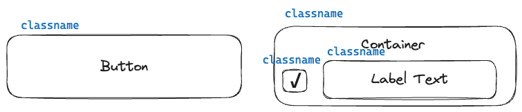
-
Every visible part of a component hast to accept a
className, which can be used to set the styling of the element. -
Every component can have default
classNamevalues. They can be overriden by a theme. -
There maybe parts of a component that are only there because of the implementation or a11y reasons. Their
classNamecan be hardcoded if necessary. (Example: Hidden<input type="checkbox">inside the<Checkbox>component for a11y). -
If the component has more than one part, the outermost slot ist called
container. -
The value of every
classNamecan be defined within a theme. It will override the defaultclassNamevalues, if there are any. -
The styles of a component, consisting of only one part, can be accessed in a theme at the following path:
components.<name of the Component>(component names are PascalCased) -
If a component consist of mulitple parts, its styles can be accessed in a theme at the following path:
components.<name of the Component>.{ [slot in SlotName]: Styles }(component names are PascalCased)
This codeblock show how to apply classNames on the <Input> component which has diffrent slots. It can be styled through theme with certain slots: icon, action and input.
<div
  className="group/input relative flex items-center"
  data-icon={icon && ''}
  data-action={action && ''}
>
  {inputIcon}
  <input
    {...props}
    className={cn(
      'flex-1',
      'disabled:cursor-not-allowed',
      '[&[type=file]]:border-none [&[type=file]]:p-0',
      '[&[type=color]]:ml-0 [&[type=color]]:border-none [&[type=color]]:bg-transparent [&[type=color]]:p-0',
      classNames.input
    )}
    ref={ref}
    type={type}
  />
  {inputAction}
</div>- Use Tailwinds group modifier to style children based on a parent state.
- Use the selector from
tailwindcss-react-aria-componentsto style a component based on its state.
This is how a style file with slots look like.
const Input: ThemeComponent<'Input'> = {
  icon: cva('left-2'),
  action: cva('right-0'),
  input: cva([
    'leading-[2]',
    'read-only:focus:border-border-light read-only:focus:outline-none',
  ]),
};
Structure of Color Design Tokens
- Color design tokens need to have a semantic name that reflects their use case. (e.g.,
bg-disabledfor disabled backgrounds) - Every color token needs to have a description when and where to use it.
- Prevent using the color pallete directly (e.g., instead of using
bg-red-700usebg-error)
Example of structures for surface colors:
  surface: {
    /**
    * Use this for base layer.
    */
    DEFAULT: white,
    /**
    * Use this for e.g. card backgrounds.
    */
    raised: white,
    /**
    * Use this for e.g. popovers.
    */
    overlay: white,
    /**
    * Use this for lowered elements.
    */
    sunken: gray[100],
  }
Usage and Structure of Style Props
- Style props are using tokens from TailwindCSS by default.
- Every layout component should have style props to make its layout adatable.
- UI Components should have style props when there it is possible to configure properties related to layouting the component (e.g., text alignment, spacing, …).
- Values of the style props have to correspond to a scale in TailwindCSS (e.g.,
width={full}will be translated to the classw-full).
Example of how we use style-props from TailwindCSS
const width = {
  full: 'w-full',
  auto: 'w-auto',
  px: 'w-px',
  0: 'w-0',
  '0.5': 'w-0.5',
  1: 'w-1',
  '1.5': 'w-1.5',
  2: 'w-2',
  '2.5': 'w-2.5',
  3: 'w-3',
  '3.5': 'w-3.5',
  4: 'w-4',
  5: 'w-5',
  6: 'w-6',
  7: 'w-7',
  8: 'w-8',
  9: 'w-9',
  10: 'w-10',
  11: 'w-11',
  12: 'w-12',
  14: 'w-14',
  16: 'w-16',
  20: 'w-20',
  24: 'w-24',
  28: 'w-28',
  32: 'w-32',
  36: 'w-36',
  40: 'w-40',
  44: 'w-44',
  48: 'w-48',
  52: 'w-52',
  56: 'w-56',
  60: 'w-60',
  64: 'w-64',
  72: 'w-72',
  80: 'w-80',
  96: 'w-96',
};<TextField label="My Label" width={40} />