Building Forms
Marigold Form Components
Form components are individual elements that make up a form, such as text fields, checkboxes, radio buttons, select fields, text areas and buttons. They allow user input, selection and actions.
Marigold has a set of form components that you can use to build your form.
- Autocomplete
- Button
- Calendar
- Checkbox
- ComboBox
- DateField
- DatePicker
- FieldGroup
- NumberField
- Radio
- SearchField
- Select
- Slider
- Switch
- TextArea
- TextField
Field Anatomy
An accessible form input includes a clear label associated with its corresponding form control (<input>, <select>, ...). Additional guidance is provided by a help text, which can give additional context or instructions or display a descriptive messages.
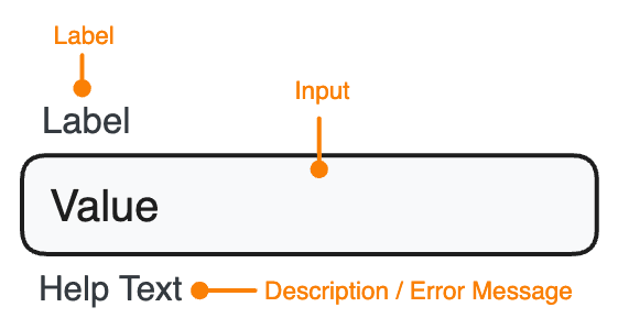
Marigold's form components allow to set these properties like shown below. All form components allow to set a label, description and errorMessages besides some additional control-specific props.
<TextField
  label="Promo Code"
  description="You can find the code on the back of your ticket."
  errorMessage="The promo code was already used."
/>
How to layout a form?
A form layout should be structured in a logical and easy-to-understand manner. This typically includes grouping related fields together, using clear and concise labels for each field, and providing clear instructions for filling out the form. Additionally, it is important to consider the overall layout of the form, including the use of white space and the placement of buttons and other elements. Accessibility best practices should be followed, such as providing clear, descriptive labels and ensuring that form fields are appropriately labeled and structured for screen readers.
Here you can see how to layout a classic form with Marigold's <TextField> and <Select> components.
If you want to see more examples of forms with Marigold, check out our recipes: Marigold Form Recipes
Account Registration
Controlled or uncontrolled Components?
In React, there are two main types of form components: controlled and uncontrolled.
Controlled components are controlled via React state (e.g. useState). Any changes to the value will update the state variable. This happens when the user interacts with a component and an event handler is called, onChange for example.
Uncontrolled components don't use any state to update. You can use props like defaultValue or defaultChecked to set their initial value.
When the state or props change, React will automatically re-render the component with its new data. This is called data-binding. Components recive data from its parents component and update their output in response to changes in that data by using state and props, this allows to have a dynamic and reactive user interface.
Interactive Forms
Interactive forms can have several features like error handling, validation, real-time feedback (password-strength indicator), logic (hide fields if a several field is checked etc.) or autocomplete. All these features help to make interactive fields more user friendly and more efficient.
Error Handling
Marigold's form components comes with the error prop. You can use it to show or hide the error message (errorMessage). If no error is present the field will display a help text (description), if given, instead.
In this example below you can have an example on how to check if the E-Mail adress is correctly filled. Try out and type something!
Account Registration
Logical Interaction
You can have interactive forms which contains logical aspects. In this example you can interact with the <Select> and a new component <Checkbox> will appear. You can try out and switch the value of the select field.
Account Registration
Forms and submitting Data
In HTML, forms are build using the <form> element, which wraps a set of input fields to gather and submit user data. By default, HTML forms trigger a full-page refresh upon submission. To gain control over the process, you can use preventDefault during the onSubmit event, enabling you to make a custom API call to submit the data according to your preferences.
The simplest way to get data from a form is using the browser's FormData API during the onSubmit event. This can be passed directly to fetch, or converted into a regular JavaScript object using Object.fromEntries.
Make sure to include the name attribute in each field, as it uniquely identifies each form element, facilitating server-side processing and ensuring a key-value pair for data submission.
Below is a basic example of extracting data from an uncontrolled form. Submitting a promo code won't trigger a regular form submission; instead, it will display the provided data.
Handling complex forms and form state
You can simplify form handling in your React components and avoid repetitive tasks such as manually updating the form state, validating user inputs, and handling form submissions.
We decided to use react-form-hook for this because its reducing re-renders caused by state updates, you don't have much to configure and supports integrating UI libraries.
For the later we use the <Controller> component from react-hook-form, which must be wrapped around each Marigold component that should submits data.
In the formular we have used <TextField>, <Select> and <Checkbox> components. These components are wrapped around with the <Controller> component from react-hook-form. The <Controller> component acts as a bridge between the form element and the react-hook-form state management. It updates the react-hook-form state whenever the value of the form element changes.
Account Registration
How to do validation and error signaling
Some fields are required and throw error messages if you don't fill them out.
For this to work, react-hook-form has a property formState, which contains the boolean isValid. This prop is set to true if the form doesn't have errors. isValid will always observe the entire form to validate.
We don't explicit need to use a onChange event, instead of using useState and set a value we used directly defaultValue. With that the component is a uncontrolled component, it never gets undefined or null.
There are rules that can be applied on the components to trigger the validation, e.g. required: true. Our Marigold form components already have error properties and error messages build in. Now it should be combined. In the handleSubmit function we check if the recived data is valid, if that isn't the case we give the error value to the component and display the error message.