Tokens Guidelines
On this page, you'll discover detailed specifications for design tokens — the foundational elements that unify the visual language of your brand or products. Explore how design tokens are constructed and find information on where each token is applied within the design ecosystem.
For those interested in understanding our token structure, the most effective way is to explore the JSON structure directly. Note that tokens directly derived from Tailwind CSS are omitted for brevity.
Naming Convention
Knowing how to read token names helps you find the right token quickly in both designs and code.
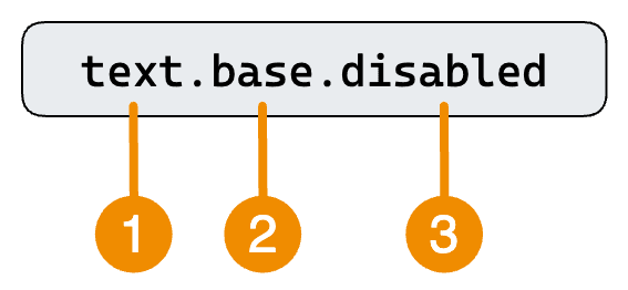
The name of a design token describes how it should be used, with each part indicating a specific aspect of its usage. Our tokens consist of the following parts:
- Property: The property of an UI element the token should be applied to, like a background, text or border.
- Intent: Identifies different use cases for a token. For example, to indicate user feedback or visual hierachy.
- Modifier: Additional details about the token's purpose. In most cases, this is an interaction state, but it can also indicate where, contextually, the token should be applied (e.g. "raised" in the surface tokens). The
DEFAULTmodifier can be omitted.
Color Tokens
Color tokens leverage the primitive tokens that form the color palettes of our design system. They provide a systematic approach to managing and applying colors consistently across various elements, while ensuring a cohesive and harmonious visual identity.
Text color tokens can also be employed to colorize icons since they all have
the currentColor CSS rule applied.
Text
Property Name: text
Text tokens are used to apply specific colors to text, equivalent to the color CSS rule or the text utilities in TailwindCSS.
Intents
Below, you'll find all the available intents for the text tokens:
- base: Default values for a specific category of tokens, serving as the foundational colors
- inverted: Alternative default values used when the base color lacks sufficient contrast ratio, ensuring accessibility
- brand: Represents the primary brand color of the company, establishing a consistent visual identity
- accent: Signifies the accent brand color, adding emphasis and vibrancy to the overall design
- info: Represents a feedback color conveying auxiliary information, providing additional context
- success: Serves as a feedback color to indicate successful actions or positive outcomes
- warning: Functions as a feedback color, drawing attention to situations where user intervention is required
- error: Functions as a feedback color in situations of errors or destructive actions, signaling potential issues
Modifiers
The following modifier can be applied to all the aforementioned intents:
- DEFAULT: Default color for text
- hover: Color when text is hovered with a mouse
- disabled: Color when text is used in a disabled control or field (only available when using the "base" or "inverted" intent)
Background
Property Name: bg
Background tokens are used to apply specific colors to the background of an element. They are equivalent to the background-color CSS rule or the bg utilities in TailwindCSS.
Intents
Background tokens incorporate the same intents as text tokens (base, inverted, brand, accent, info, success, warning, error) and have the following additional intents:
- selected: Indicates that a specific item from a list or option is chosen
- surface: Functions as the background for a particular surface level
- masterMark: Used in our Core System to show specific permissions only RX employees can use.
- adminMark: Used in our Core System for permissons only developer can see.
Modifiers
The following modifier can be applied to all a background token:
- DEFAULT: Default background color
- hover: Applied when an element is hovered with a mouse (not available when using the "selected" intent)
- active: Applied when an element is active, such as when a button is pressed (not available when using the "selected" intent)
- disabled: Utilized for indicating that an element is disabled (only available when using the "base" or "inverted" intent)
- input: Used for inputs that require a more prominent visual appearance, such as radio buttons, checkboxes, and switches (only available when using the "selected" intent)
The "surface" intent is used to create visual hierachy. Because of this it has distinct modifiers compared to the other background intents. Only the following modifiers can be used with it:
- DEFAULT: Applied to elements that represent the basline for all other surface layers, like the
<body>element - raised: Used for elevated surfaces, such as cards
- overlay: Applied to surfaces with significant height, like popovers
- sunken: Applied to surface that creates a backdrop
Border
Property Name: border
Border tokens are used to apply specific colors to the border of an element. They are equivalent to the border-color CSS rule or the border utilities in TailwindCSS.
Intents
Border tokens incorporate the same intents as text tokens (base, inverted, brand, accent, info, success, warning, error) and have the following additional intents:
- selected: Indicates that a specific item from a list or option is chosen
Modifiers
The following modifier can be applied to all a border token:
- DEFAULT: Default border color
- hover: Applied when an element is hovered with a mouse
- active: Applied when an element is active, such as when a button is pressed
- disabled: Utilized for indicating that an element is disabled (only available when using the "base" or "inverted" intent)
- input: Used for inputs that require a more prominent visual appearance, such as radio buttons, checkboxes, and switches (only available when using the "selected" intent)
Outline
Property Name: outline
Outline tokens are used to apply specific colors for the outline of an element. They are equivalent to the outline-color CSS rule or the outline utilities in TailwindCSS.
Intents
Outline tokens have a special use case and should be used sparingly. Their usage is reserved for indicating keyboard navigation:
- focus: Apply when an element is focused, particularly with keyboard navigation
There are no modifiers for outline tokens.
Effect Tokens
Effects serve various purposes, both aesthetic and functional. They can indicate interactivity, such as making a button appear clickable with a shadow. Additionally, effects encompass background filters like blur and animations.
Shadow
Property Name: shadow
Shadow tokens are used to apply specific shadow to an element. They are equivalent to the box-shadow CSS rule or the shadow utilities in TailwindCSS.
Intents
Shadow tokens have the following intents:
- surface: Functions as the background for a particular surface level
Modifiers
The "surface" intent is used to create visual hierachy. The following modifiers can be used with it:
- DEFAULT: Applied to elements that represent the basline for all other surface layers, like the
<body>element - raised: Used for elevated surfaces, such as cards
- overlay: Applied to surfaces with significant height, like popovers
- sunken: Applied to surface that creates a backdrop
Number Tokens
Number tokens encompass properties represented by numerical values, contributing to the management of elements such as white space and typography sizes. They play a crucial role in creating hierarchy and vertical rhythm.
Height
Property Name: h
Height tokens are used to apply specific height to an element. They are equivalent to the height CSS rule or the height utilities in TailwindCSS.
There are no semantic values assigned to these tokens, as their usage does not necessitate them. This is because the primary focus of these tokens is on visual styling rather than conveying specific semantic meaning. Additionally, the tokens often serve as a direct representation of their intended visual outcome, eliminating the need for additional semantic values.
Height tokens follow a 4-pixel grid convention, implying that their values are adjusted in increments of 4 pixels. Each token represents a multiplier of that grid. For example, a value of 2 would equate to 8 pixels.
The relevance of height is limited to specific components. In numerous cases, a component's size must align with its contents. Therefore, the use of tokens is not obligatory in every instance.
Intents
Intents for height tokens encompass attributes that foster consistency across various elements. There are the following intents:
- component: Assists in sizing elements and ensuring consistency across the design system, promoting a unified and harmonious visual presentation. This is particularly relevant for creating effective and aesthetically pleasing forms.
Modifiers
The following modifiers can be used:
- DEFAULT: Serves as the base height for form components.
- sm: Applied to display a small components.
- lg: Applied to display a large components.
Width
Property Name: w
Width tokens are used to apply specific width to an element. They are equivalent to the width CSS rule or the width utilities in TailwindCSS.
There are no semantic values assigned to these tokens, as their usage does not necessitate them. This is because the primary focus of these tokens is on visual styling rather than conveying specific semantic meaning. Additionally, the tokens often serve as a direct representation of their intended visual outcome, eliminating the need for additional semantic values.
Width tokens follow a 4-pixel grid convention, implying that their values are adjusted in increments of 4 pixels. Each token represents a multiplier of that grid. For example, a value of 2 would equate to 8 pixels.
Spacing
Property Name: gap
Spacing tokens are used to apply specific width to an element. They are equivalent to the gap CSS rule or the gap utilities in TailwindCSS.
There are no semantic values assigned to these tokens, as their usage does not necessitate them. This is because the primary focus of these tokens is on visual styling rather than conveying specific semantic meaning. Additionally, the tokens often serve as a direct representation of their intended visual outcome, eliminating the need for additional semantic values.
Width tokens follow a 4-pixel grid convention, implying that their values are adjusted in increments of 4 pixels. Each token represents a multiplier of that grid. For example, a value of 2 would equate to 8 pixels.
You can explore all the available spacing options on the design tokens page.
Radius
Property Name: rounded
Radius tokens are used to apply specific radius to an element. They are equivalent to the border-radius CSS rule or the border radius utilities in TailwindCSS.
There are no semantic values assigned to these tokens, as their usage does not necessitate them. This is because the primary focus of these tokens is on visual styling rather than conveying specific semantic meaning. Additionally, the tokens often serve as a direct representation of their intended visual outcome, eliminating the need for additional semantic values.
Radius tokens adhere to T-shirt size conventions, with designations such as lg (large), md (medium), and so on. You can explore them on the design tokens page.